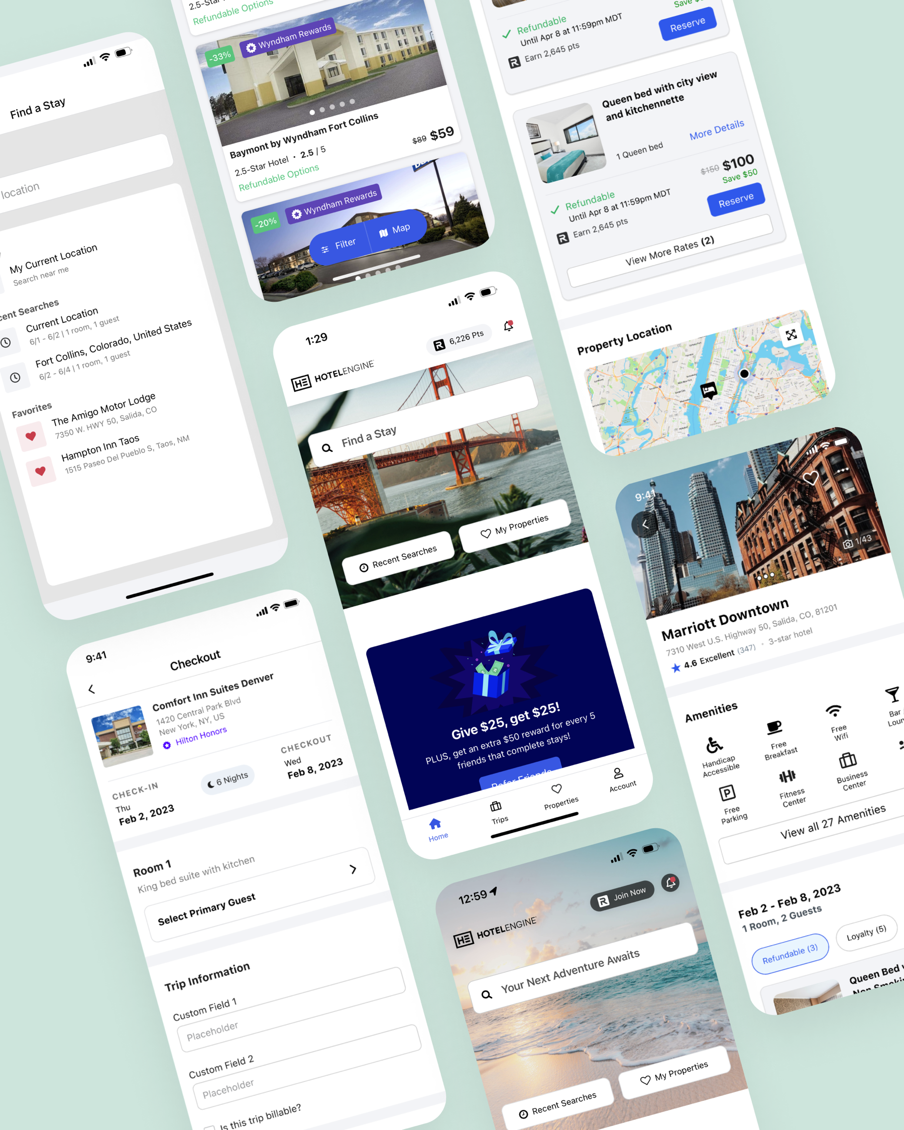
Case Study 03
Native
App
The Problem
Built for the road warrior.
Our clients are often on the go for work and need a place to stay for the night.
Imagine driving all day for work and then having to use an app that was confusing, slow and overly difficult when all you wanted to do was relax. Our native app was outdated, lacking key functionality, not serving the unique needs of our clients and demanded a major redesign.
Project Goals
The Team
Who built it.

My Role
As the lead Product Designer for our native app, I am in charge of creating a product that brings functionality and design direction to our mobile users. I identified features that needed adoption on the app, designed true native interaction patterns, and created workflows that our admin users needed to do their jobs.
I also created a design guide for engineers and fellow designers to follow so our app was always built around best design practices no matter what team worked on it. For this project I focused on three key pages: the dashboard, property page and checkout.

Design Timeline
Roadmap and gaps.
I collaborated with the Leadership team to prioritize the roadmap and identified the pages and features we wanted to implement. Parts of the design process included design sprints, data collection, design iterations, user testing and leadership feedback.
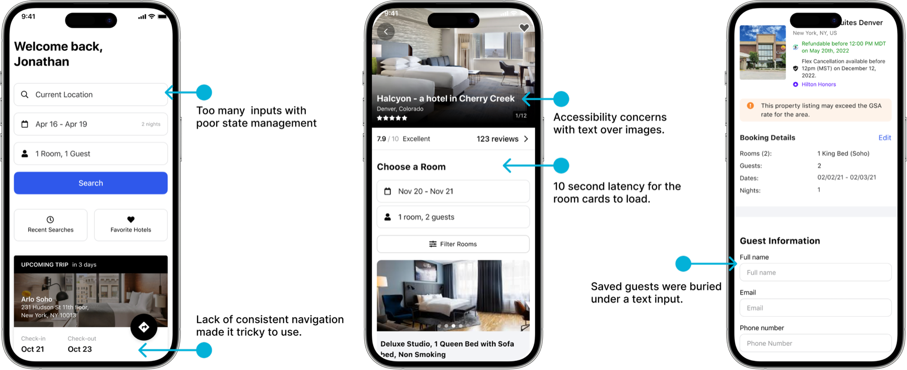
Legacy Experience Critique
- Our current dashboard had too many inputs and was confusing to users.
- Our property page had major accessibility concerns, and room rate latency issues which caused users to think the page was broken.
- Our checkout was really hard to navigate on a mobile device and entering guest information was a chore.
Design Process
Sprint, data, Crazy 8s.
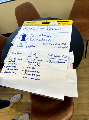
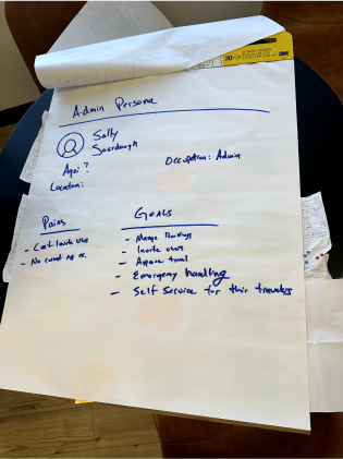
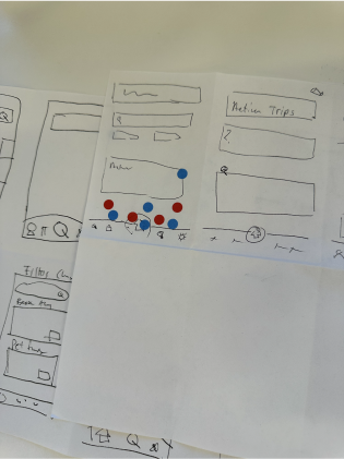
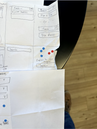
I led a design sprint with Engineering Managers, Product Managers, Designers, Data Scientists, Member Support staff and key Stakeholders to discover our current app’s biggest gaps and pain-points. We dove into the current app’s faults and led a walk-the-store exercise with everyone searching for a hotel and completing checkout. I then asked everyone to report their issues and quickly a common pattern emerged. Next I had our data team dig into our current app’s usage numbers to gauge who was using our app and how they most commonly searched for hotels.
Lastly I led a Crazy 8s design session to start exploring new ideas for our app. I often find Crazy 8s is a great way for non designers to share their ideas and allow their creative sides to shine. We had numerous great ideas that I would begin prototyping out.
Competitive Analysis
I researched companies in our market share as well as more consumer facing Online Travel Agencies to understand what other designs were in the hotel app experience. I found a common pattern emerging on a simplified search flow that auto prompted users to enter location details, dates and guest information. I had found our first big opportunity to design a better native app experience.








Research
Findings &
Opportunities
Findings
- Internal interviews revealed centralized admins manage travel for the company and often need to book hotels for their employees while they are not in the office.
- Our data showed the highest percent of our app users are road warriors and needed to find places to stay for that night.
- Our data also showed a majority of bookings are in small towns with low hotel volume.
- A whopping 74% of all our native app bookings were same day bookings for 1 night total.
- Users relied on ratings, photos and amenities when picking out their hotels but often struggled to find this information.
Opportunities
- Make it easy for travel admins to find hotels that work for each guest and make it simple to select that employee at checkout.
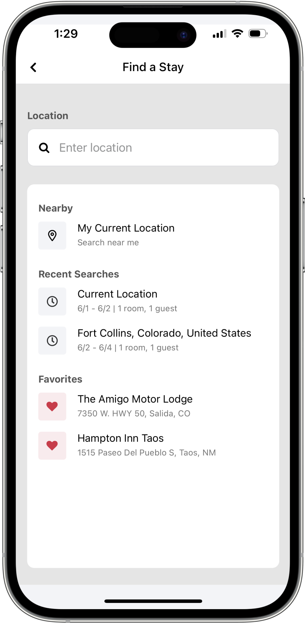
- Simplify our search patterns to make it easy to find a hotel nearby or suggest cities they often stay at.
- Inform travelers on their limited choices and suggest the best properties available in that area.
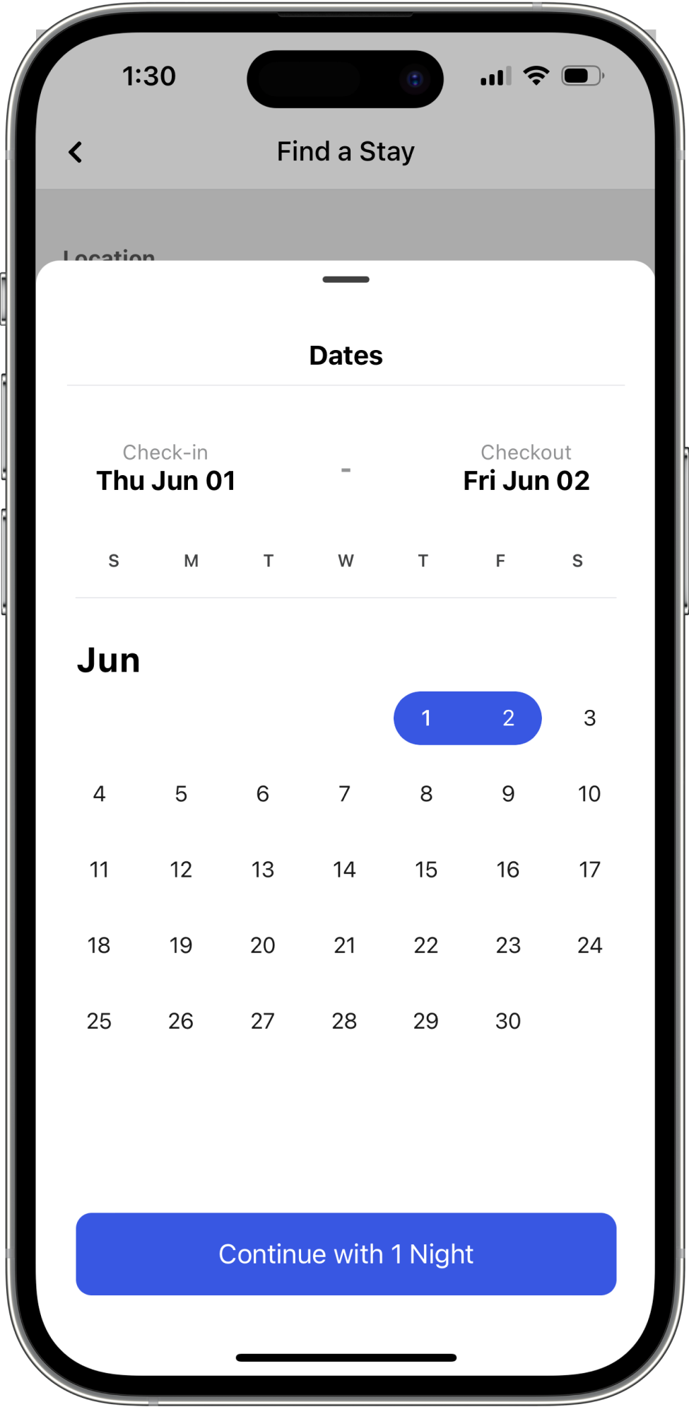
- Auto select a 1 night stay for users instead of forcing everyone to interact with the calendar widget.
- Make it easy to view amenities, ratings and photos for each room and allow room rate data to load in the background.
Of native app bookings were same day, single night stays
Key pages redesigned — dashboard, property and checkout
Competitor apps analyzed across OTAs and hotel brands
Design Iterations
Exploring the dashboard.
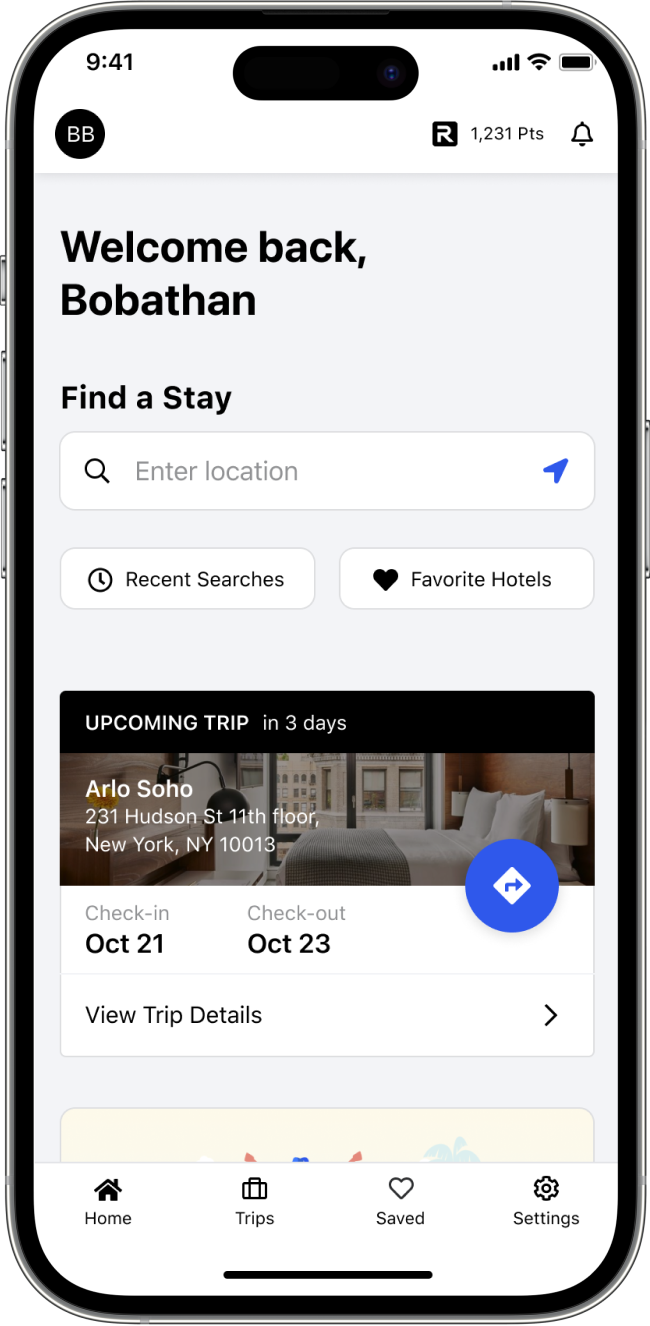
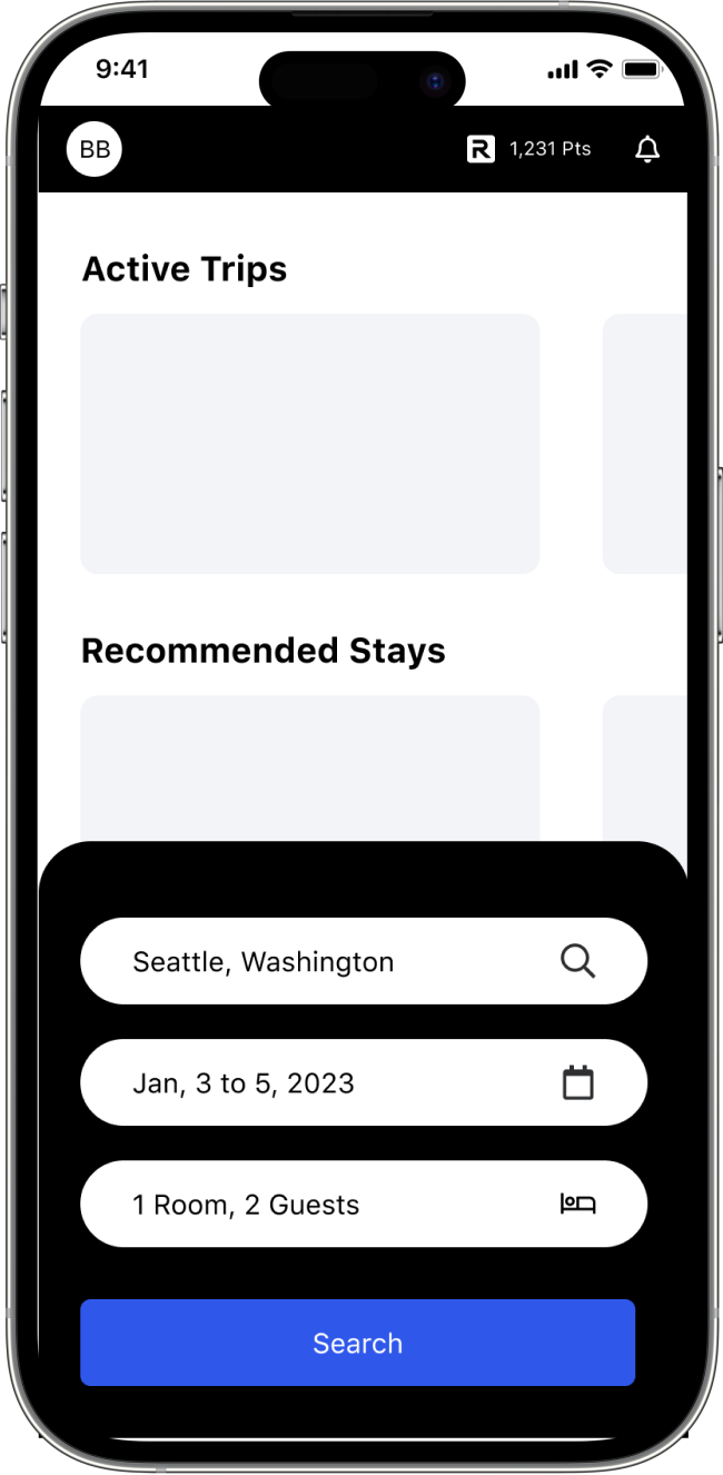
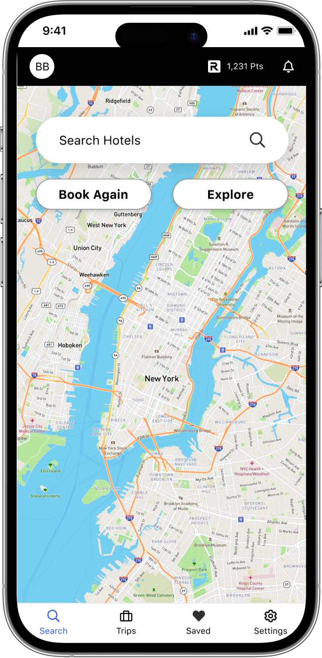
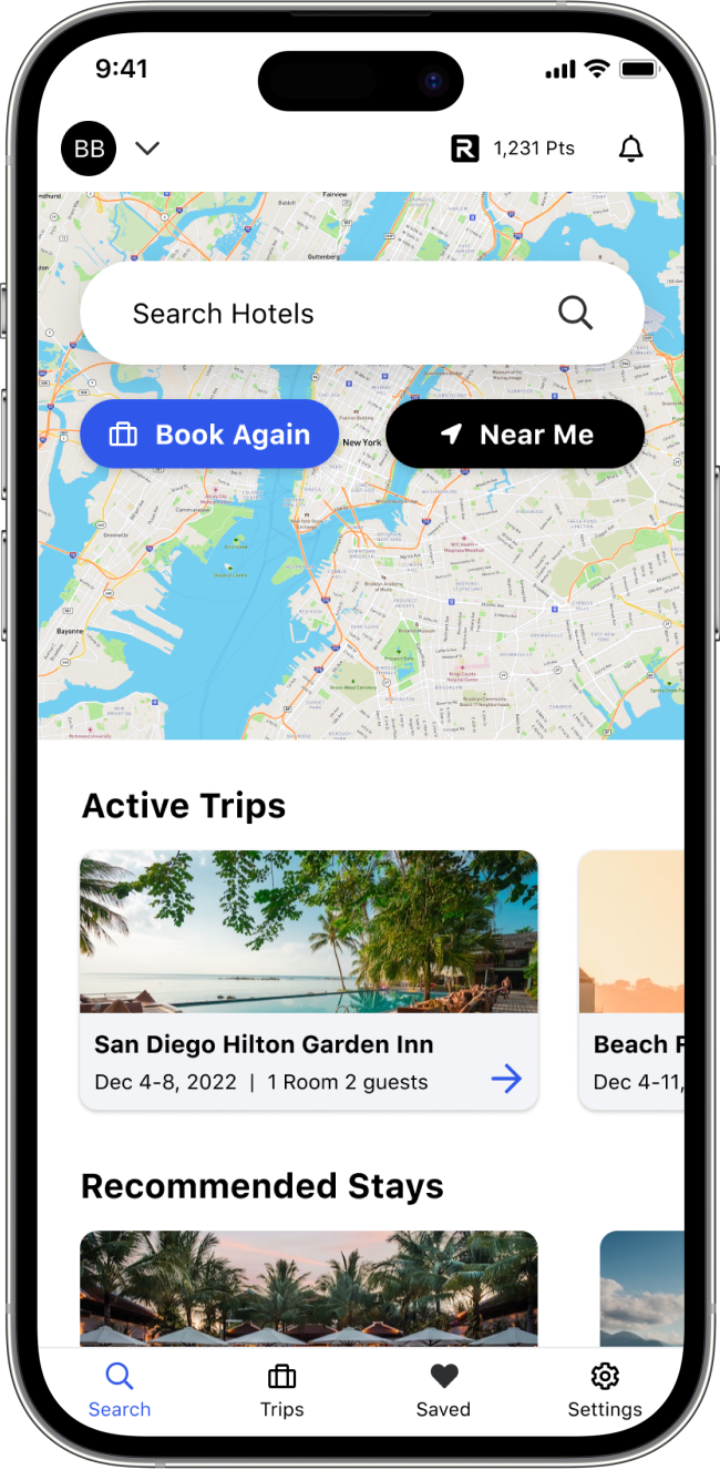
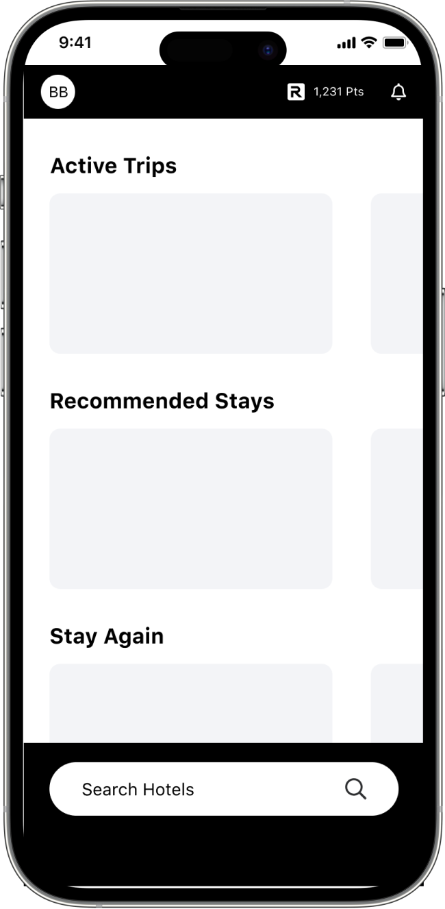
After our design sprint I experimented with a lot of design opportunities for our new dashboard. Ideas ranged from a super simple approach with nothing but a search field to a map experience similar to Google Maps. I tested out different designs in user testing and collaborated with engineering to address our tech limitations.
Due to supplier search times, I ultimately decided to not pursue a map based dashboard at this time as our current latency would cause a lot of frustration for users exploring hotels in a map environment. I focused on highlighting our search flow, and updating our navigation.
The Solution
Jobs to
be done
After several rounds of user testing, presentations to the Executive Leadership team, and critiques within the design team, I had found the design solutions for our native app.
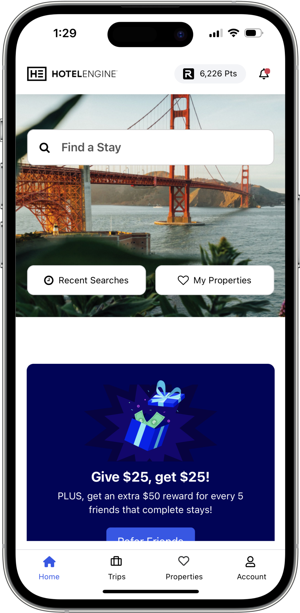
Reimagined Dashboard
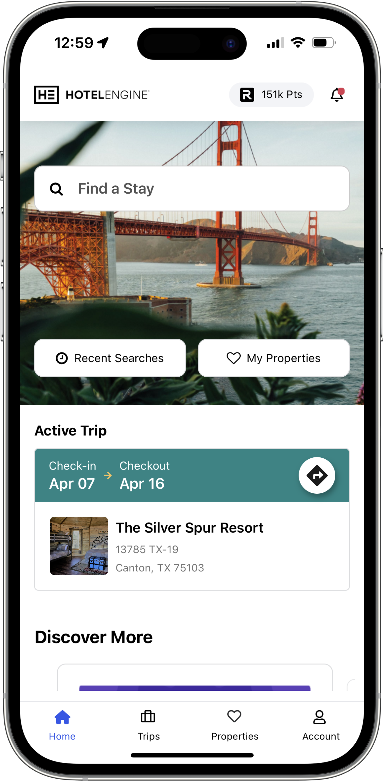
- Updated our top and bottom navigation to quickly and easily find your favorite properties, trips, rewards, notifications and account settings.
- Streamlined our search flow and gave users a clear and concise entry point into our brand new search experience.
- Utilized true native interaction patterns: bottom sheets for quicker thumb navigation and swipe gestures for deleting and dismissing.
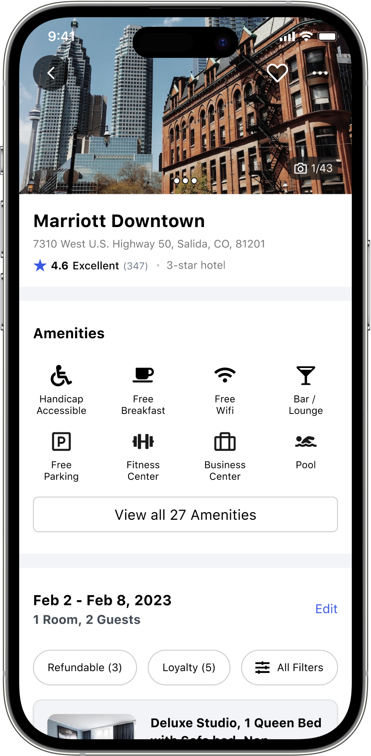
Updated Property Page
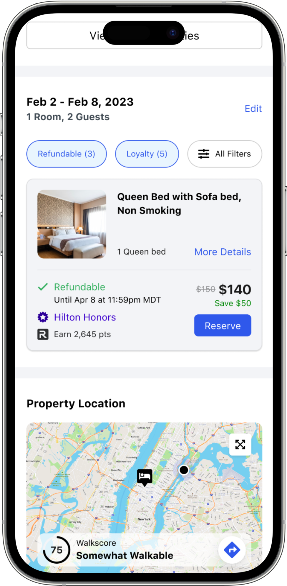
I wanted to make it easy to find all the amenities a hotel has to offer, ensure the location was ideal for their trip, and to read reviews from other travelers so that our users would feel safe and comfortable during their stay.
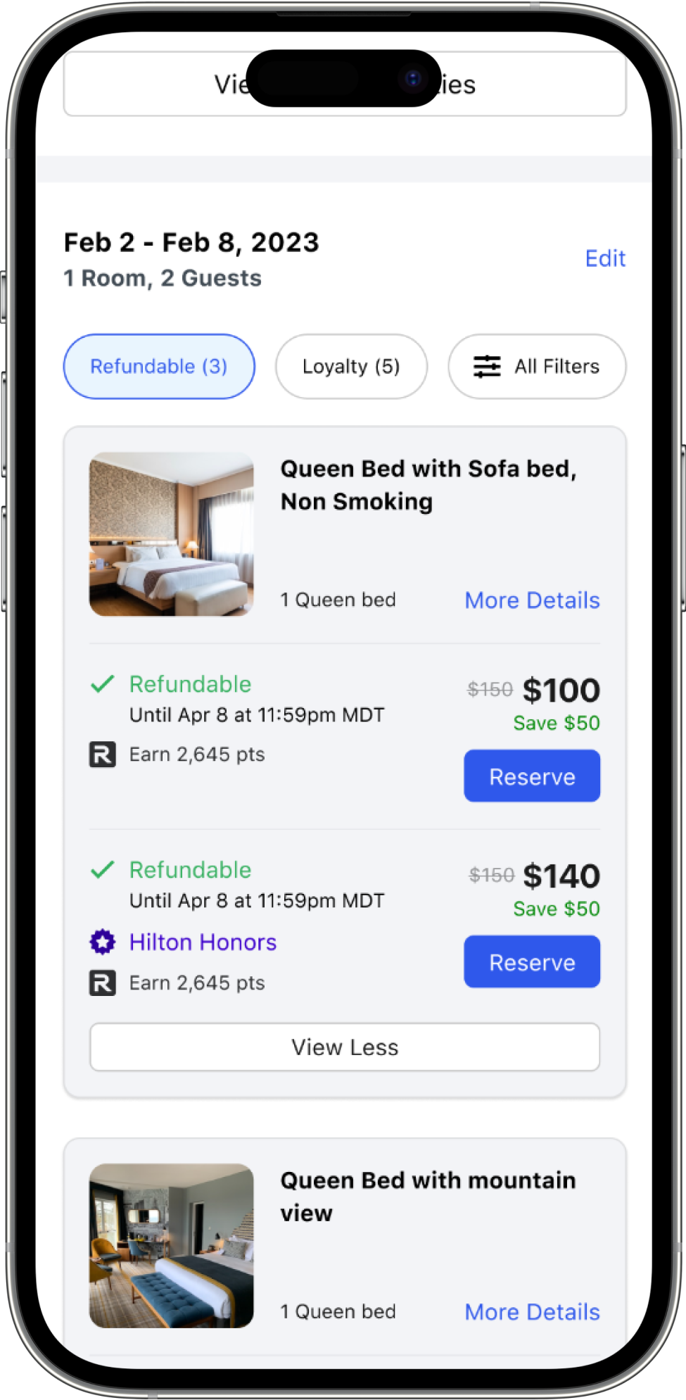
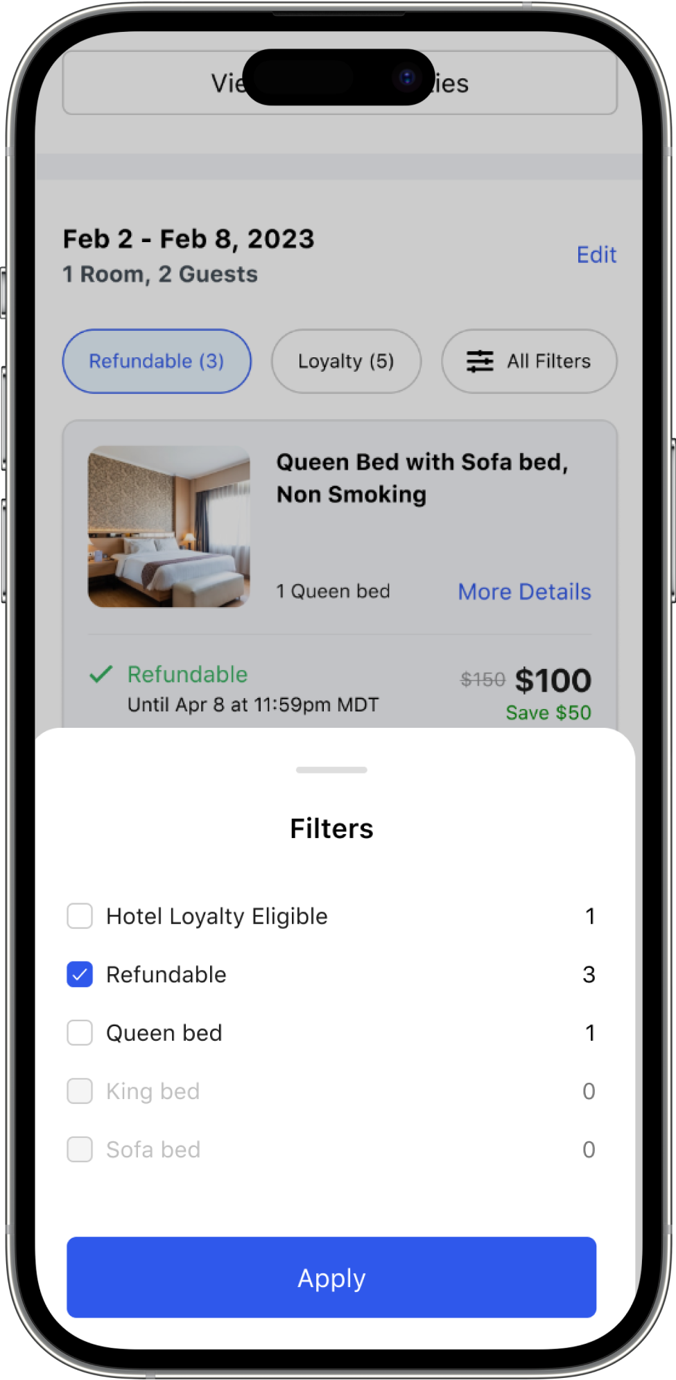
I also wanted to make it easier to find the right room at the right price. Through numerous experiments we found the right balance between the amount of data to show and the pricing information clients were focused on. I introduced quick filters to allow users to narrow down the important features they demand in a room, while still offering more detailed information if they needed it.
Simplified Checkout
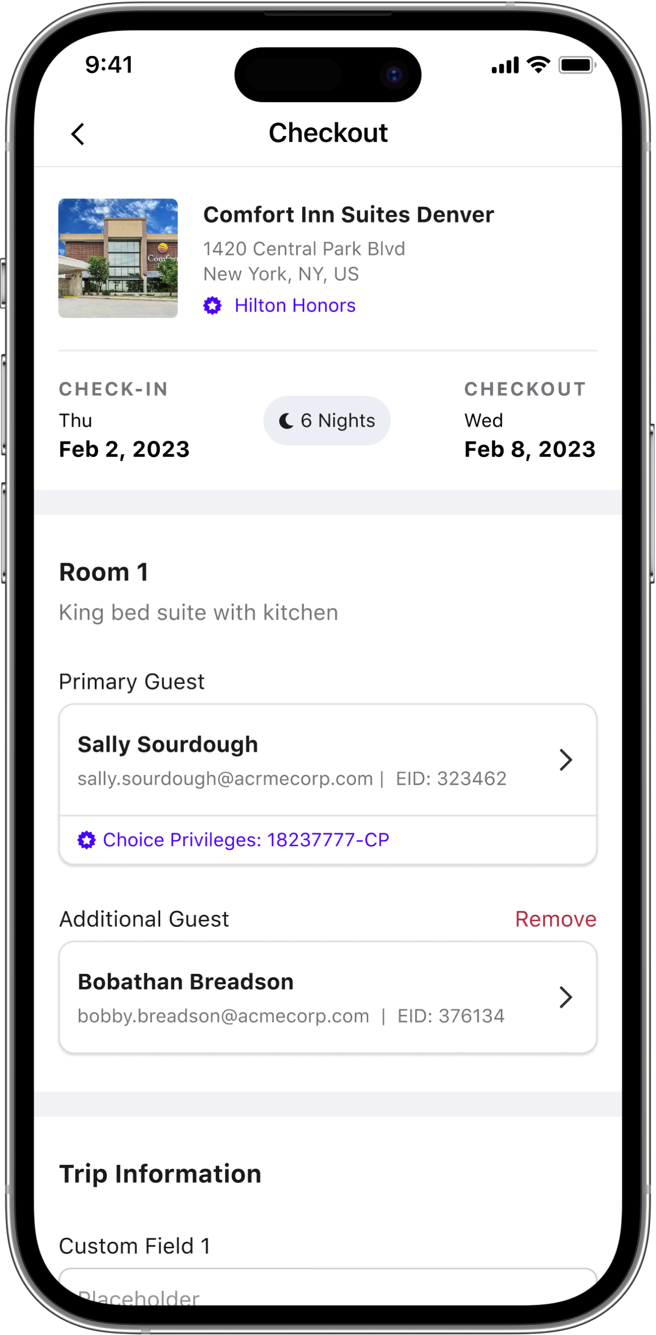
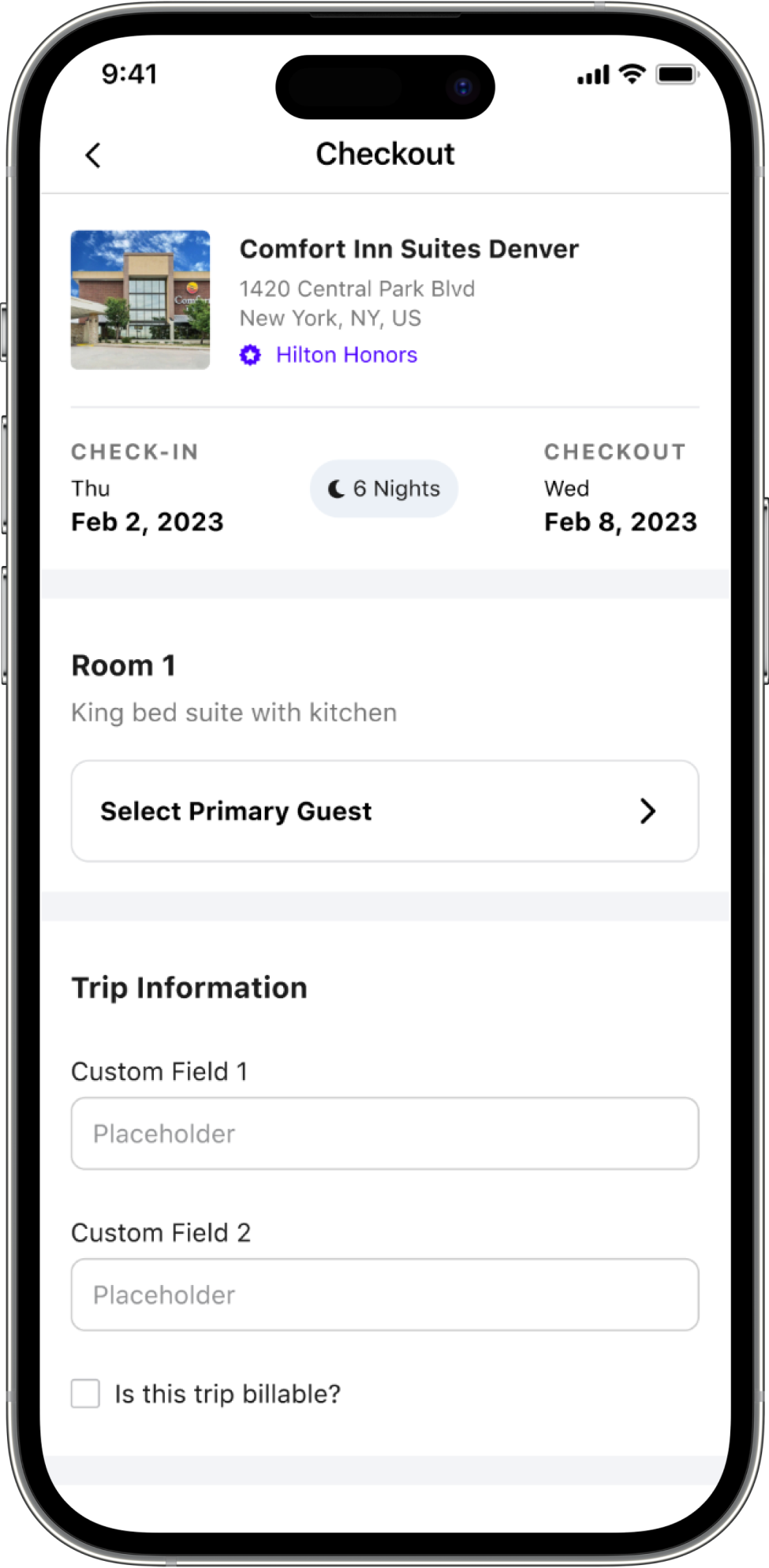
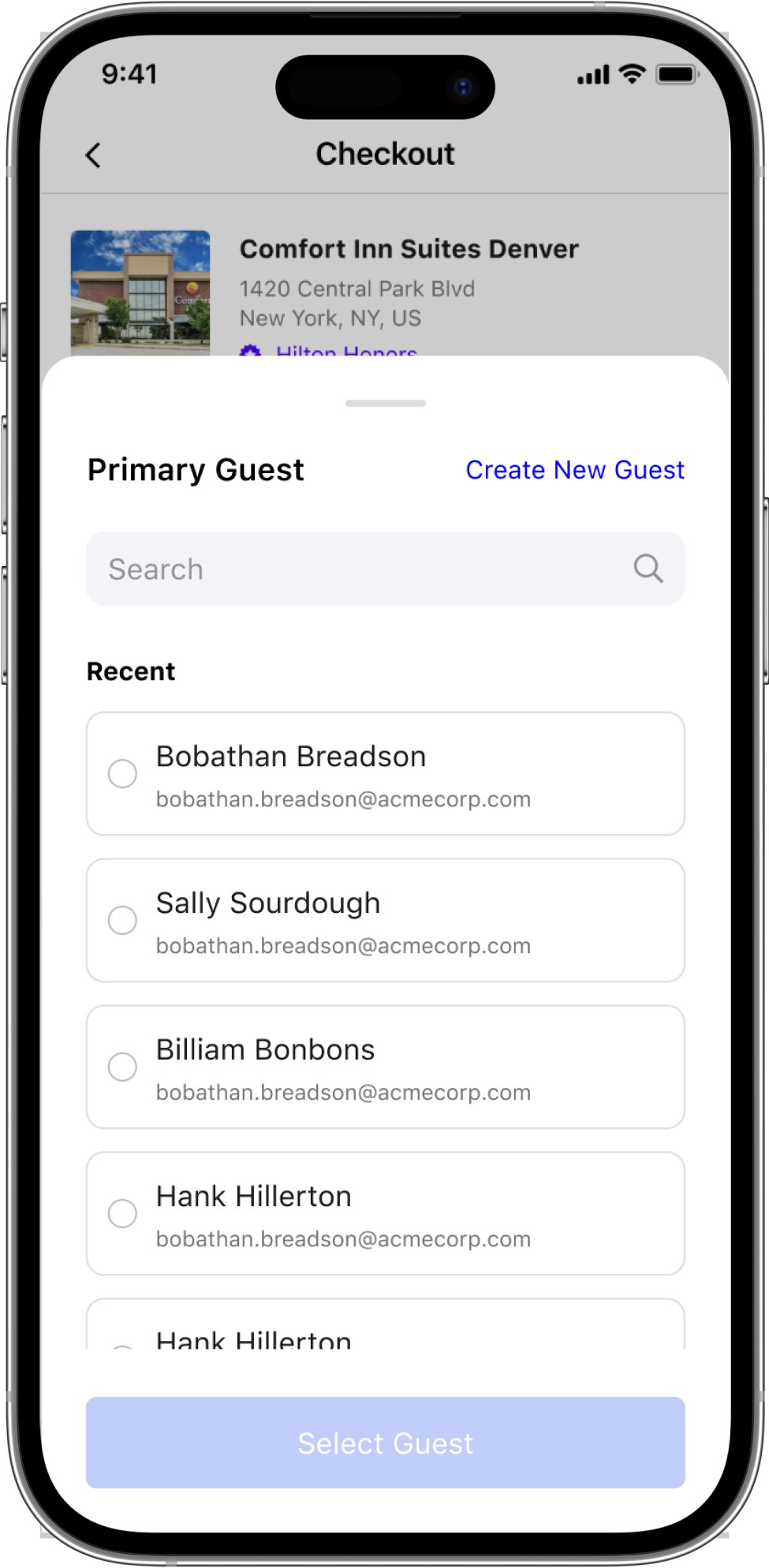
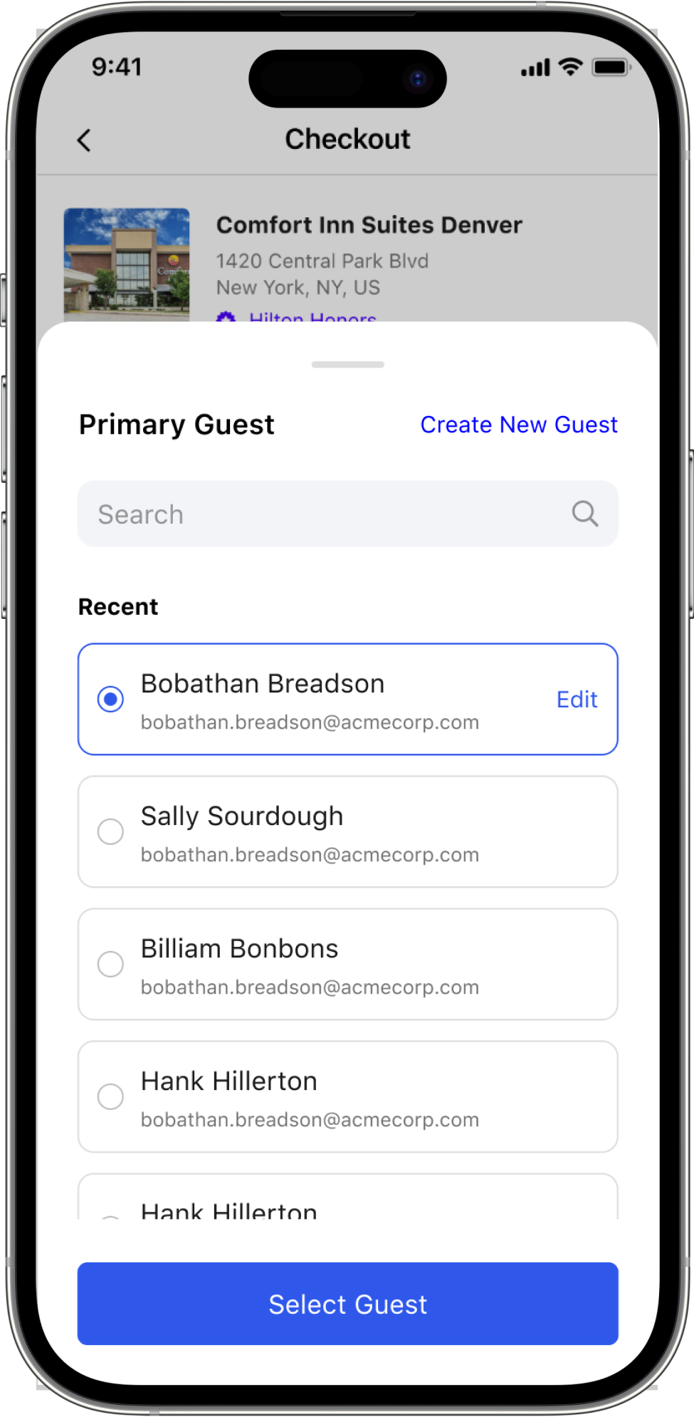
I wanted to give our travel admins the best experience possible when booking for travelers. I did this by making it much easier to find members of their team when checking out. No more searching and hoping you found the right guest — we introduced a recently booked card with smart searching to pick the right guest faster.
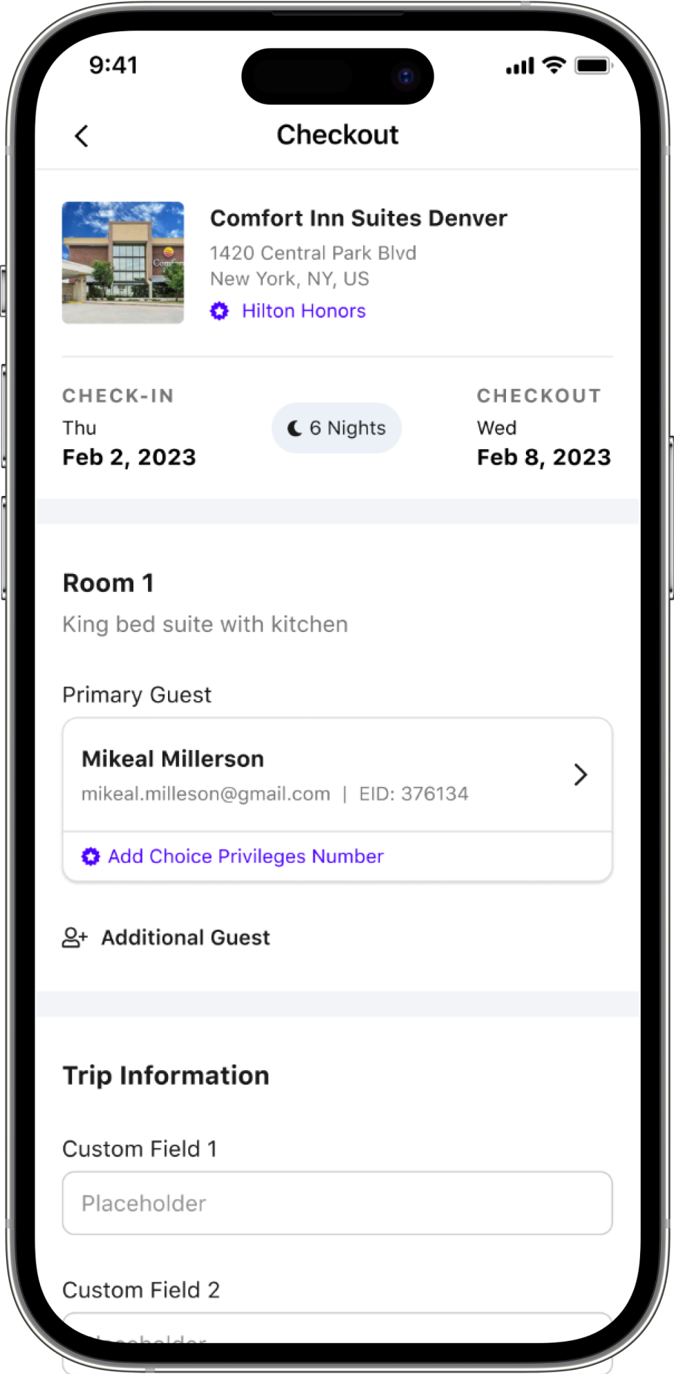
I also made it easier to add loyalty reward programs, edit users and change guests, and to switch payment methods and save defaults like Apple Pay for quick checkouts on future bookings.
Deep Dive
Search Flow
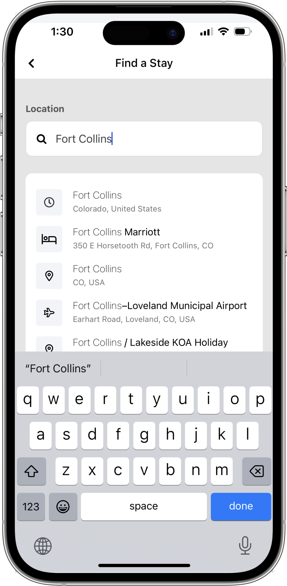
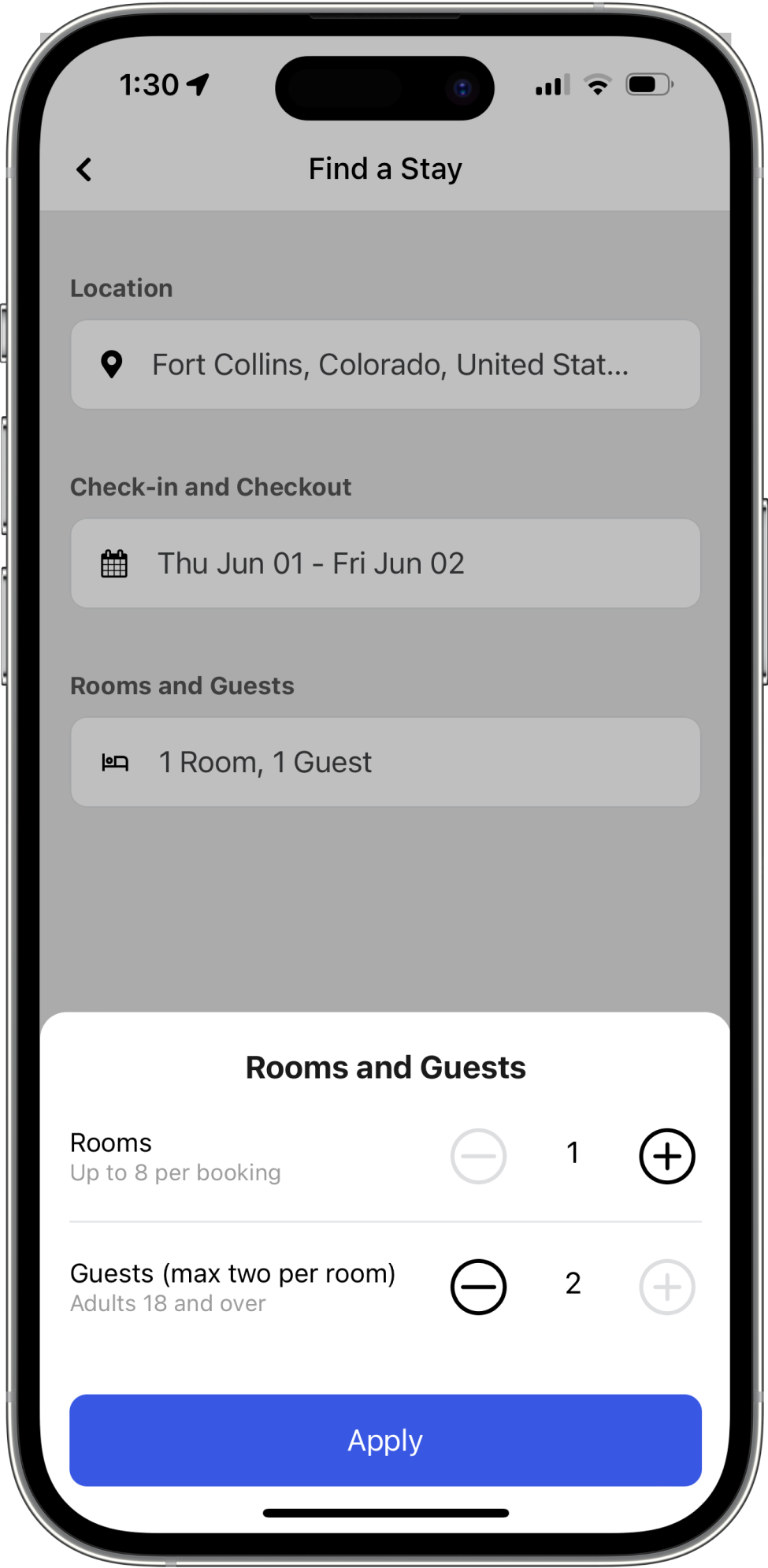
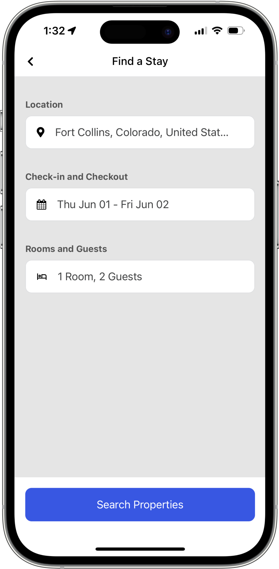
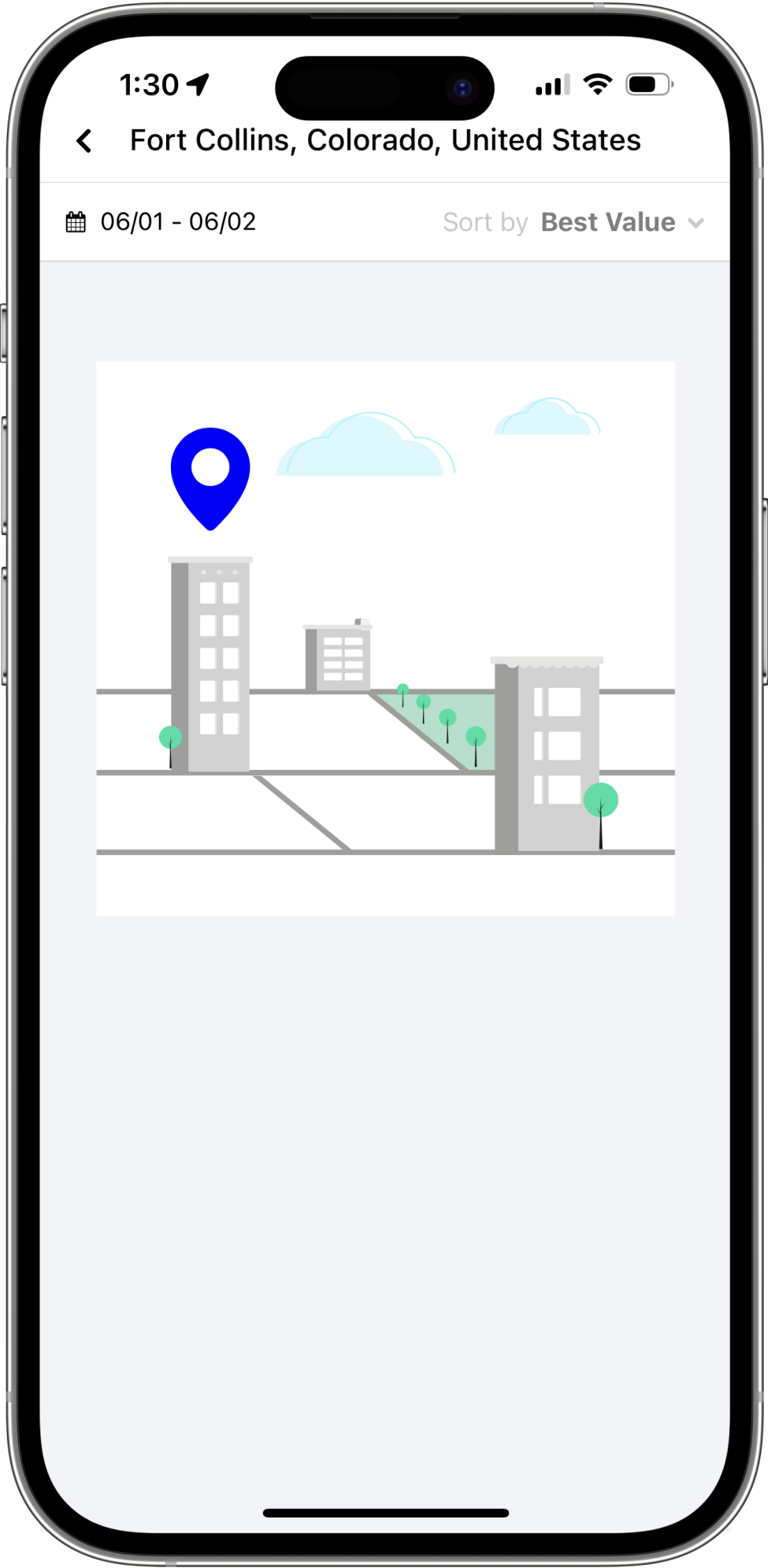
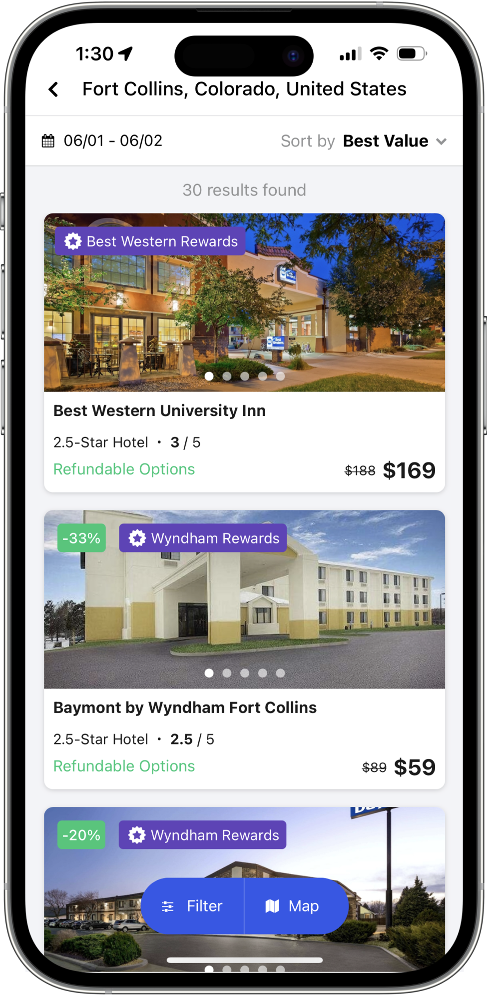
The biggest update to our new dashboard was a simplified search workflow. Our old page had three inputs and a search button that was always enabled. This experience was clunky and often led users to either click prematurely on the search button or miss important fields like the date or guests for their trip.
I changed this with a workflow approach that simplified the entry point to one clear “Find a Stay” button, guiding users through picking their location, selecting the dates and lastly picking the amount of rooms and guests they required.
Deep Dive
Property Page Features
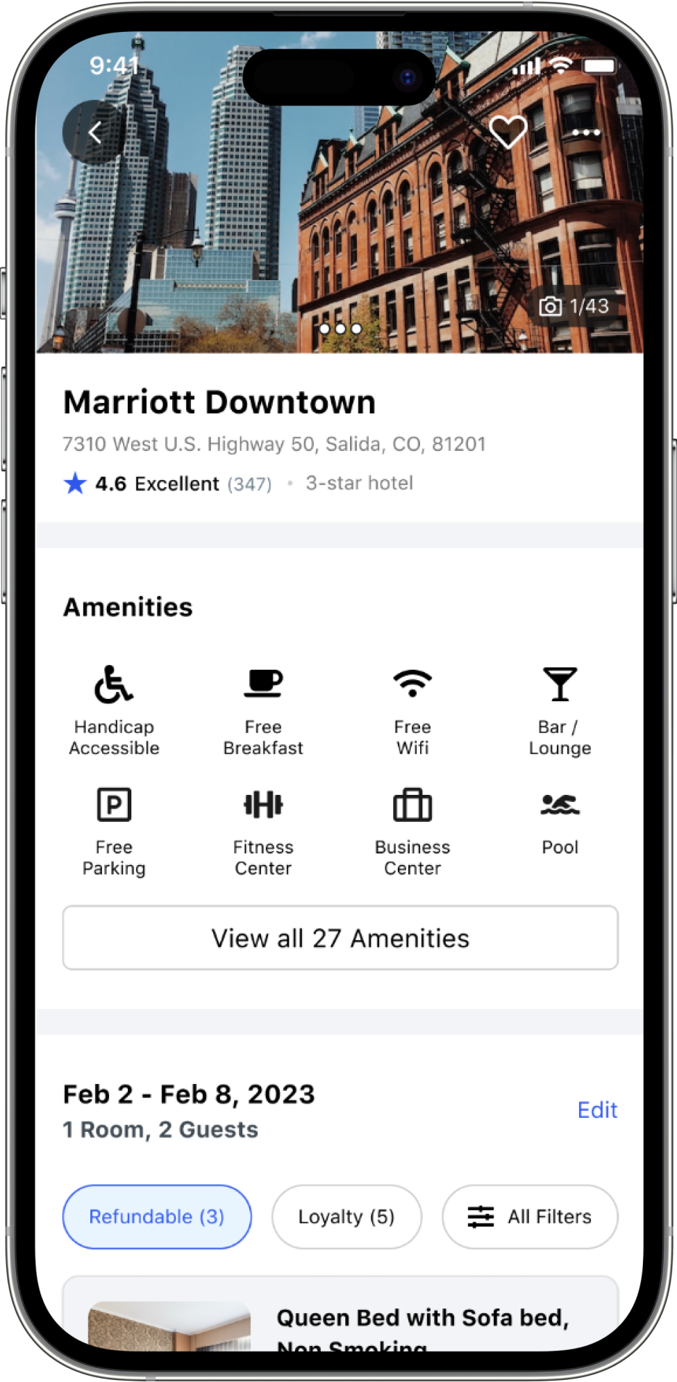
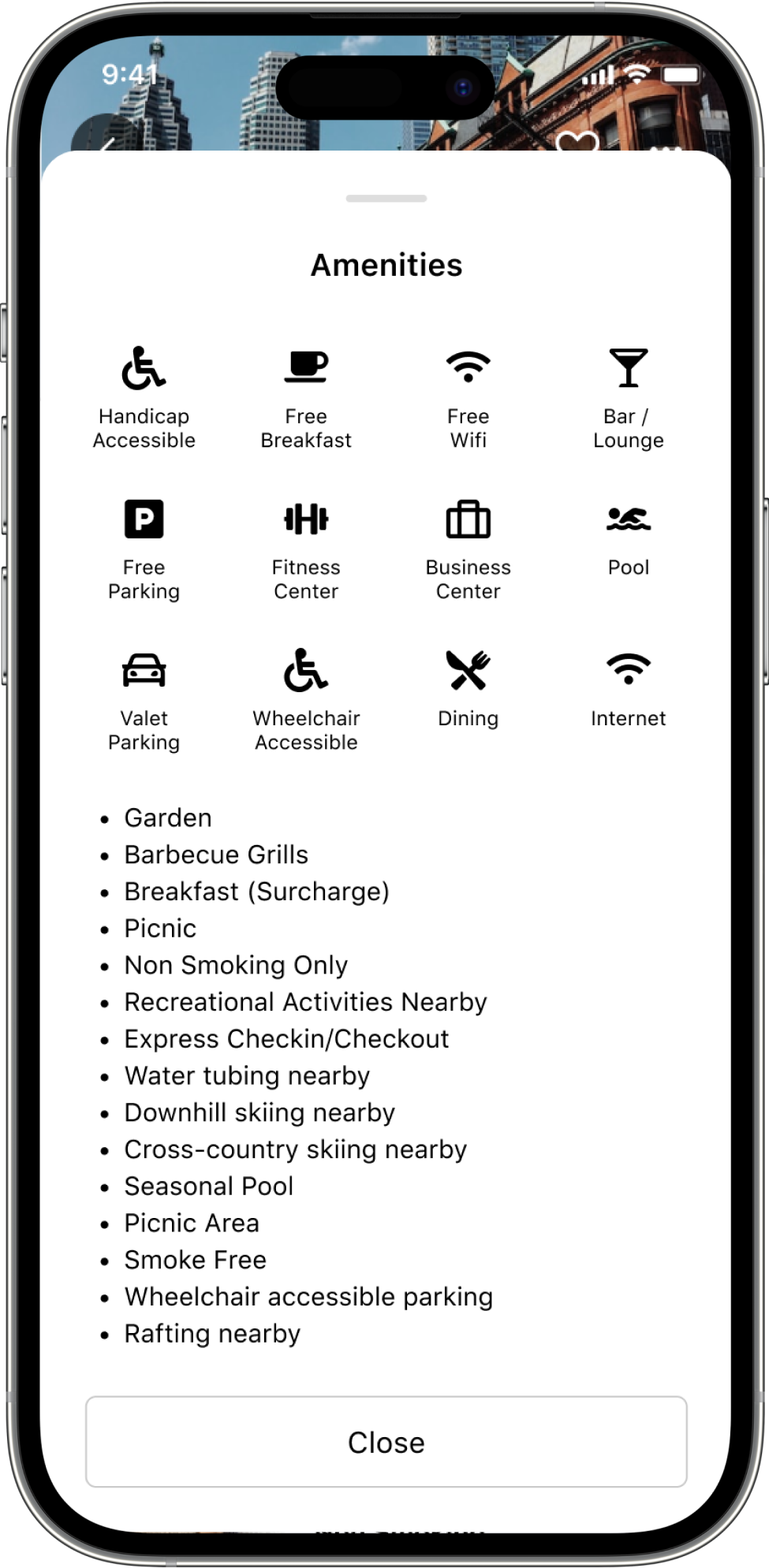
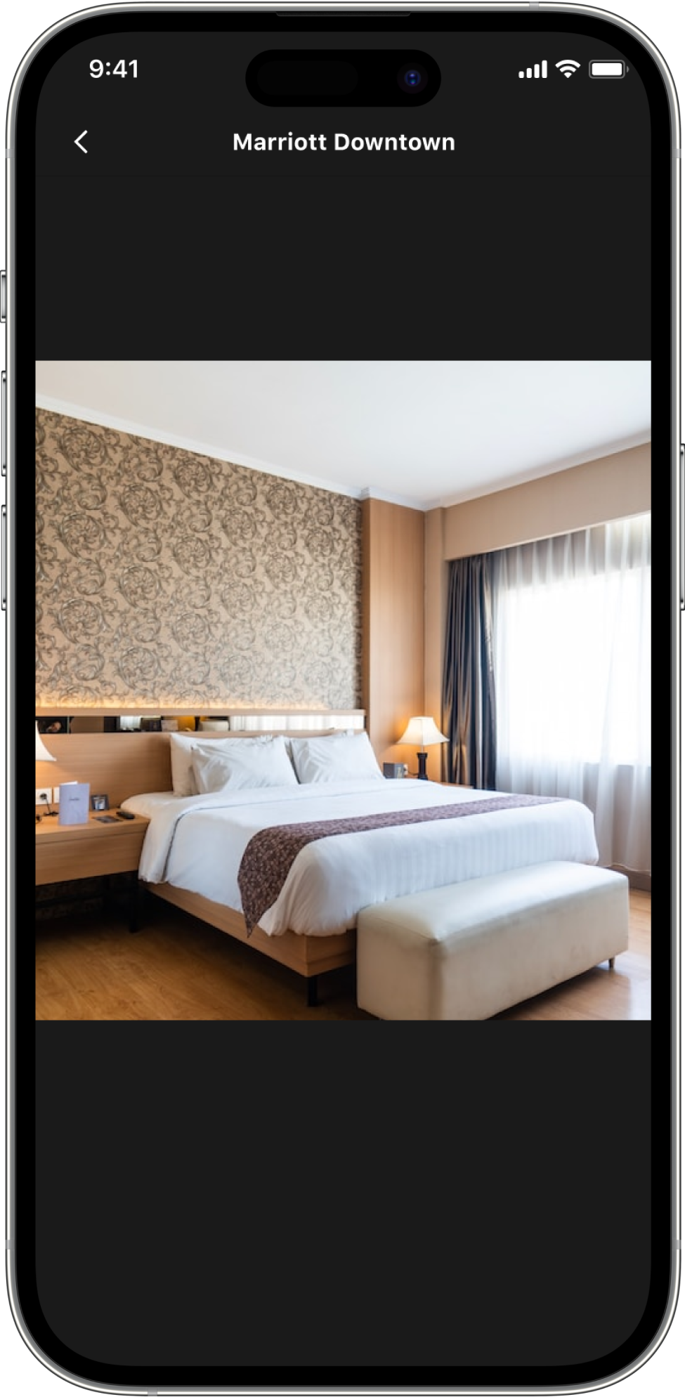
I wanted to give travelers and admins alike an updated property page that made it easy to research hotels, ensure it had all the amenities they required, has great reviews and photos, and ensure the room price fit into their travel policy.
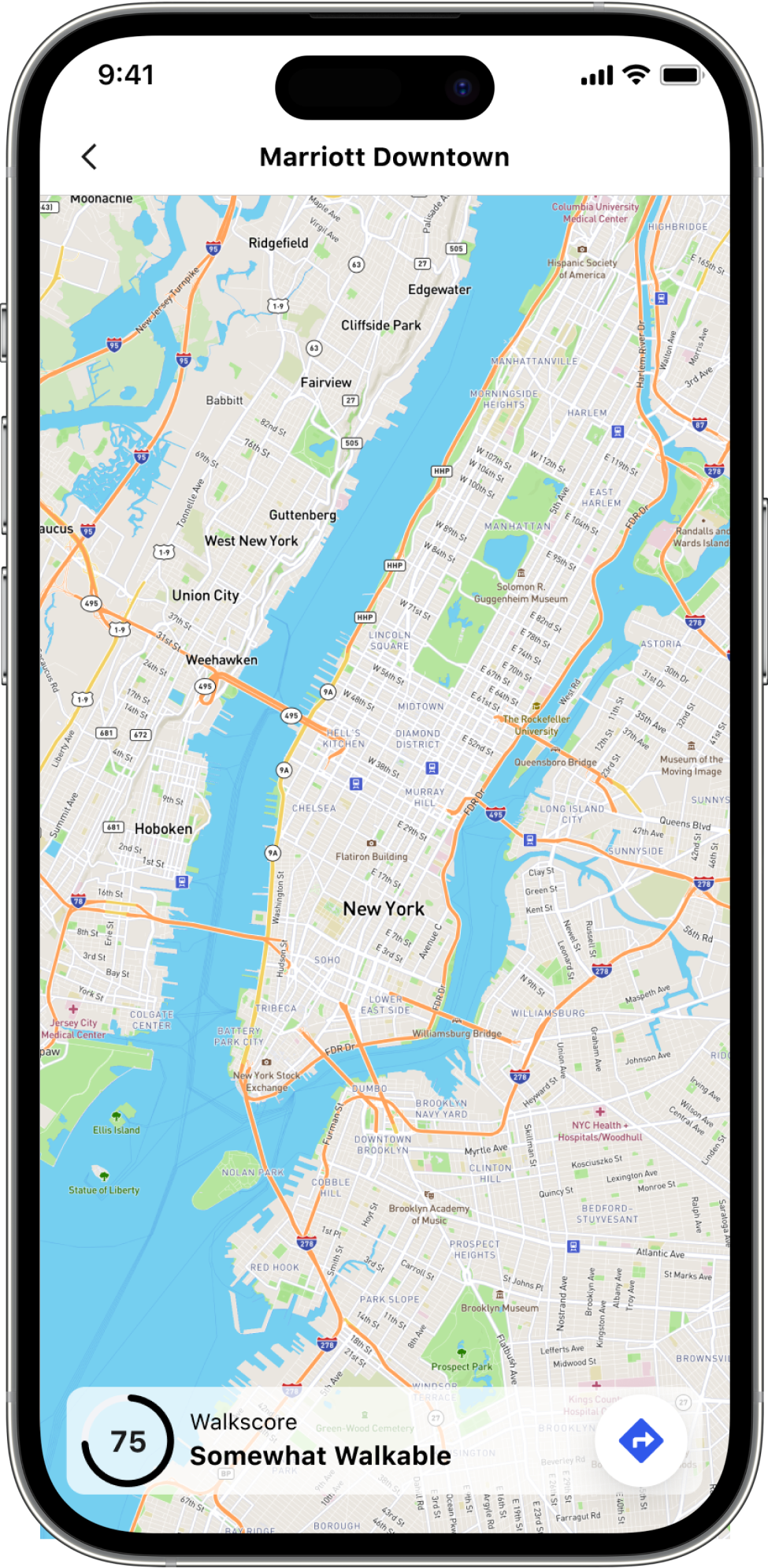
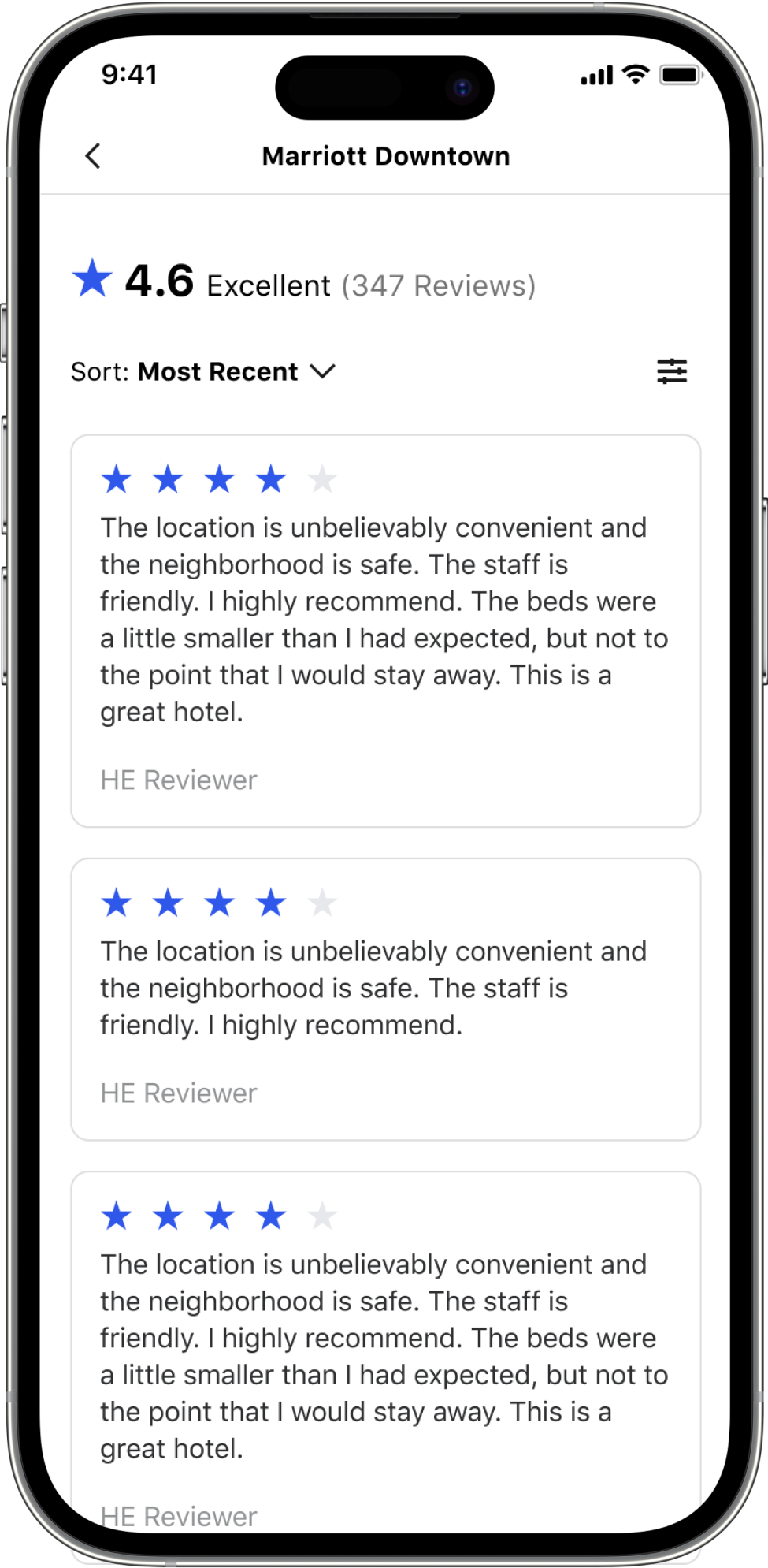
To accomplish these goals I moved the amenities section higher on the page, updated the map with walk scores, built a reviews page with filters and sort, and added quick filters to our room cards so users find the right refundable or hotel loyalty rate for their stay.
Deep Dive
Checkout Guest Selection
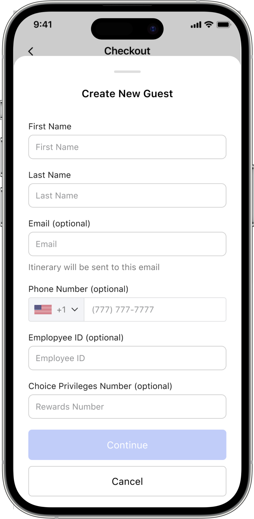
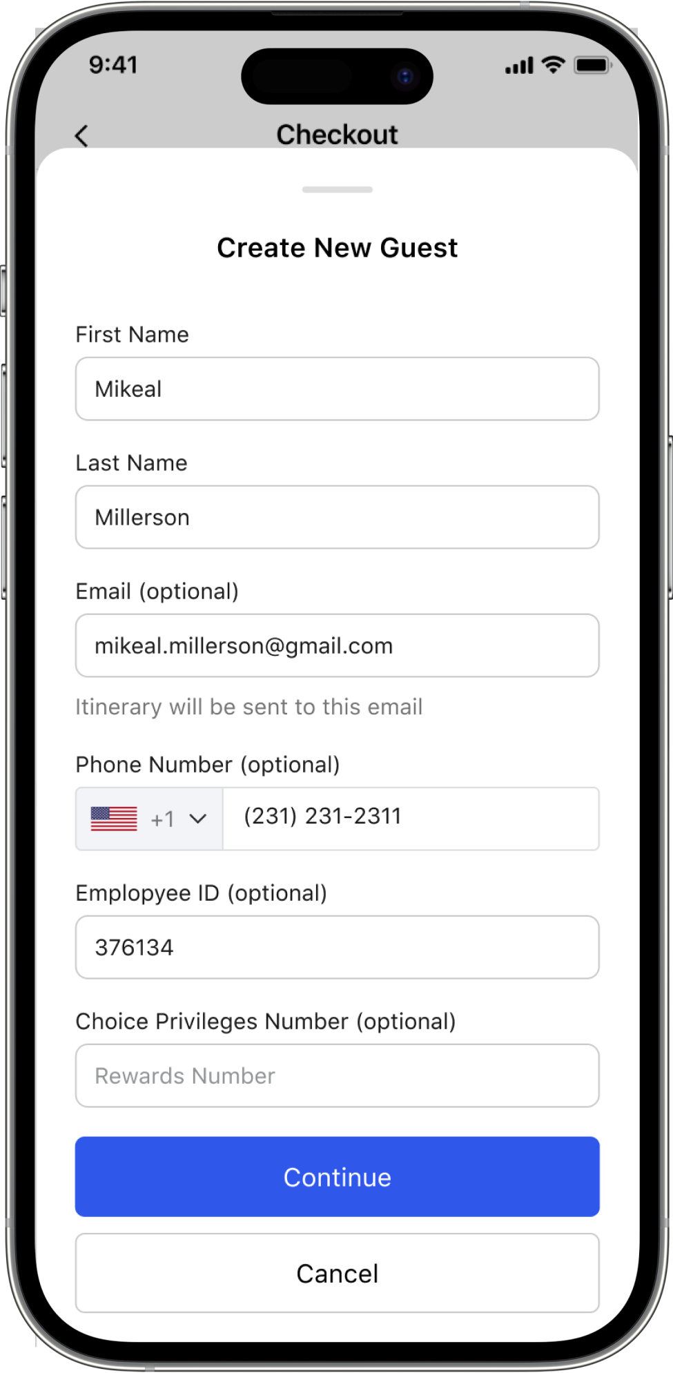
One of the biggest complaints from our current checkout was how hard it was to find the guest you needed to book for. So I completely redesigned this experience with travel admins in mind.
Admins can now tap into the guest selection button and a drawer will load with their recently booked guests, a search bar and a button to create a new guest. This updated experience makes it simple to book repeat guests and find the right traveler without endlessly scrolling hoping to find the right “Chris” in their 100 plus person member list.
Measuring Success
Three metrics to track
To ensure our new features are delivering value to our clients and the business I set up three metrics to track. I wanted to capture user feedback and overall satisfaction with a survey, track conversion rates to ensure people could move through our funnel efficiently, and lastly track the amount of repeat bookers on the native app. Data on our main platform indicated that guests who book three times are far more sticky than those who don’t hit that third booking.
We are still in the process of collecting initial data and will update shortly with our initial findings…
Up Next
More experiments
I have a full slate of experiments to track on our property page to fully optimize conversion, such as where we should place our room cards, and have more designs coming for our search results, map experience and managing upcoming and past trips.
Keep exploring